rebranding:
logo redesign + brand colours + brand guidelines
client:
Engineering firm
role:
Art direction / Design
WHY:
1. The client inadvertently ended up with at least five variants of the logo in circulation, with inconsistent brand colouring, skewed graphics and lettering, and lacking optimization for usage on the web.
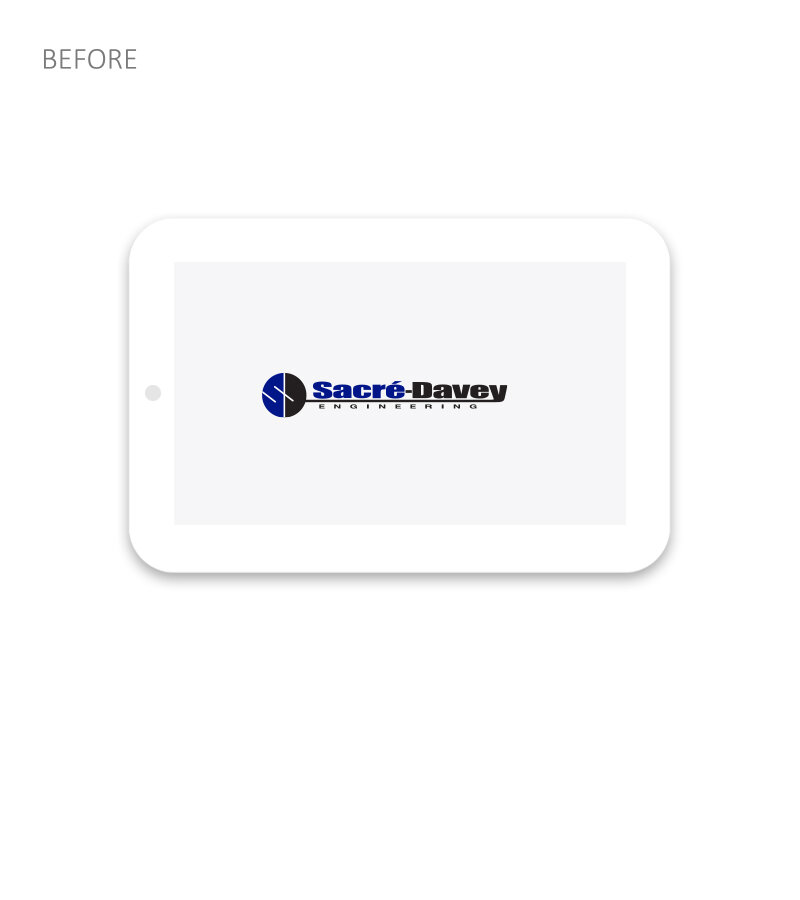
2. The client’s original logo is based on Impact typeface.
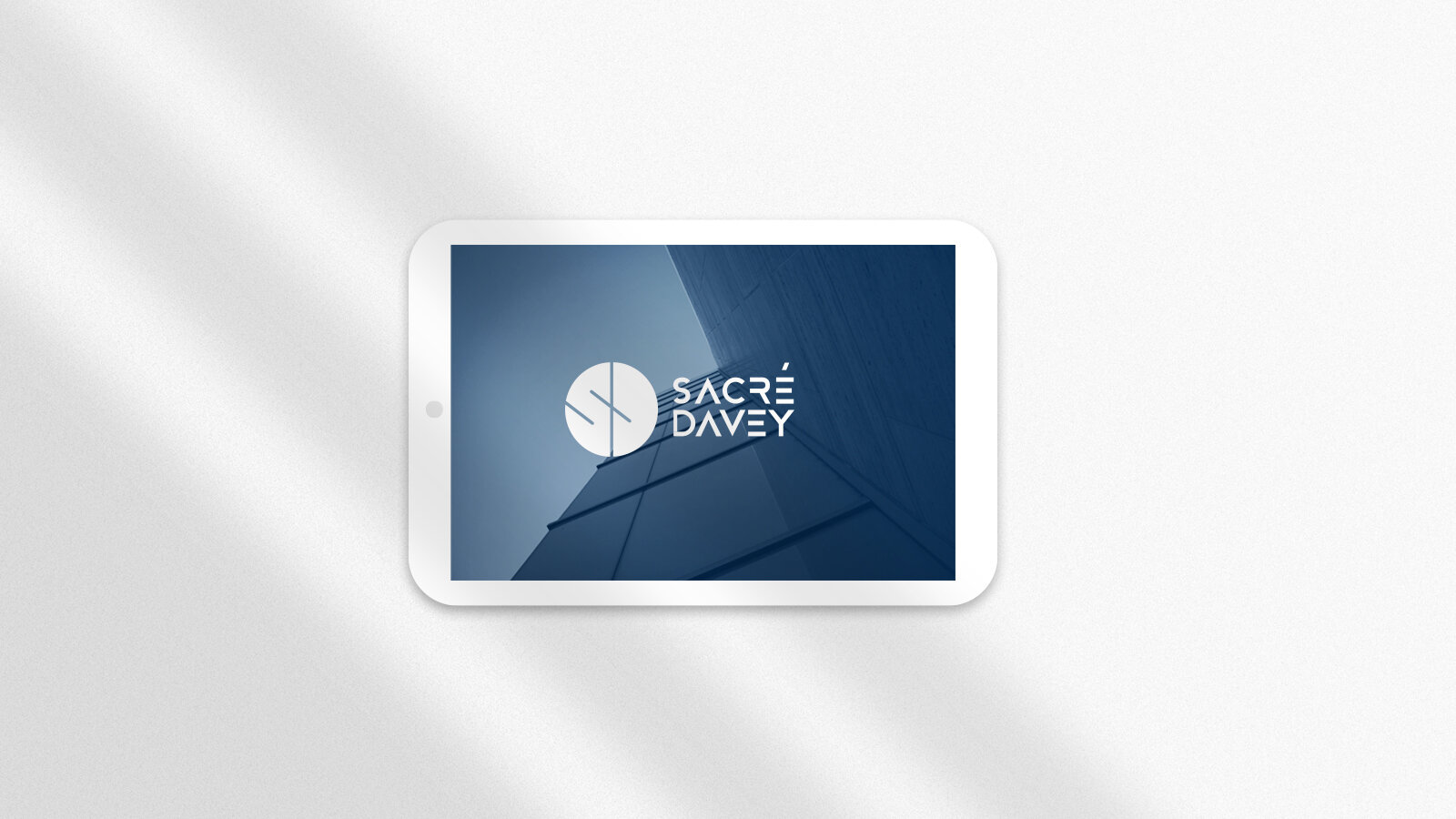
THE LOGO REDESIGN PROPOSAL: Primary focus was on modernization of the typographic part of the logo.
1. Letters "A" in the proposed logo are vertically aligned in order to visually represent an upward pointing arrows which signify growth and improvement.
2. The letter "A" is similar to the drawing compass, and the letter "E" resembles the menu list icon seen on modern web and mobile interfaces.
3. The proposed logo has horizontal and vertical versions and very effective typographic part.
4. Proposed logo is more compact, in both vertical and horizontal versions. That makes it more web friendly and more versatile.
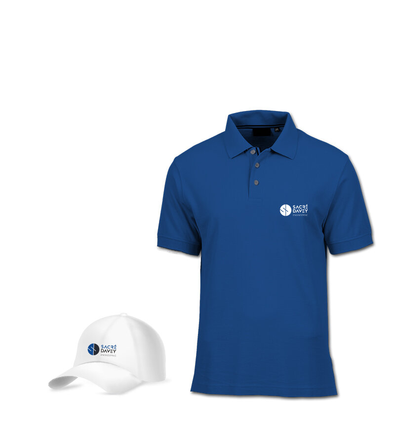
5. The brand colours have been chosen and defined in the new brand guidelines.
ADDITIONAL WORK COMPLETED FOR THE CLIENT:
Rebranding: logo redesign + brand colours + brand guidelines (please see below)
Statement of qualifications documents for eight different sectors
Sales (Cut) sheets
Portfolio sheets - available for review
Project proposal template (please see the video below)
Social media management - design and write-ups / inputs